PROCESS
Working together through the process of reinvention
As a trusted extension to the experience team, we translated Co-op’s brand strategy into a refreshed and comprehensive design system.
Making sure all employees understood why the brand was changing—and what the changes would mean to them—was a priority. Easily accessible templates and tools that worked for all departments was key.
A robust design system and sensibility with flexible templates was made to empower their teams to create materials, address challenges as they arose, and showed them how to make well-designed communications that created a more connective design language across for all audiences.
A lighter and brighter primary palette elevates the Co-op dark red and new bright red brand colors.


A new typographic sensibility required a new primary typeface. Grilli Type Foundry’s GT America family was chosen to create a stronger and more coherent messaging hierarchy. Headlines and primary messages became shorter and benefit-driven across all mediums, from white papers and websites to social media posts and presentations.

Grid proportions based on the 1:2 geometry of the logo provides a foundation to give layouts more structure—especially important in digital and event contexts.

Imagery is brighter and lighter, supported by an icon and illustration style that is shared across the ecosystem.


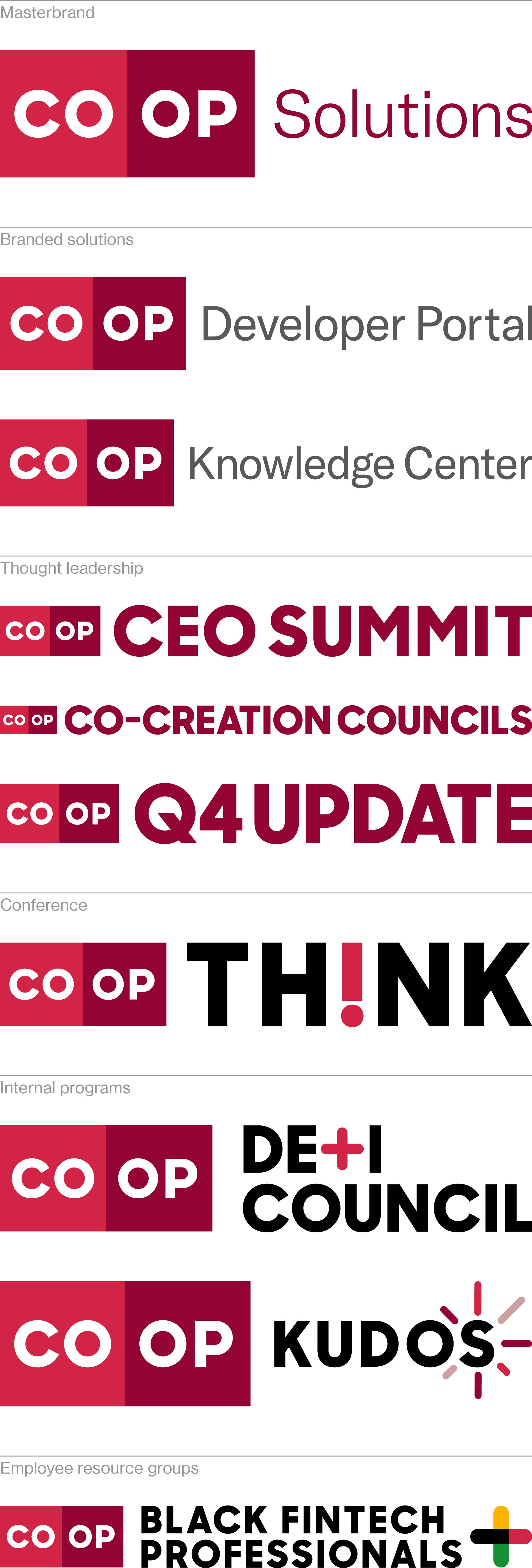
Products and services are organized into pillars to give the marketing team a framework for working with other teams across the business.
Once in place, signatures were designed to live in a range of external or internal touchpoints.
Once in place, signatures were designed to live in a range of external or internal touchpoints.
To support the online templates and tool kit on the asset hub, brand guidelines were developed for the use by both Co-op’s internal marketing team and their partner agencies.
OO&Friends make identities and systems, objects and spaces, design tools and sensibilities.
Contact
wk@outorinc.com
wk@outorinc.com
More of Wally’s design work and identity systems can be seen at Outside Order.
© 2021-2025 Outside Order Inc. All trademarks are the property of their respective owners.
Header photography © 2025 Wally Krantz.
Neue Haas Grotesk typeface by Commercial Type.
Website designed on Cargo.
Neue Haas Grotesk typeface by Commercial Type.
Website designed on Cargo.